Griffith Creative Logo
Courses 6 Graduates 67 Previous Years

Graphic Design Communication

Marcin Wrobel

Branding: The Ultimate Festival
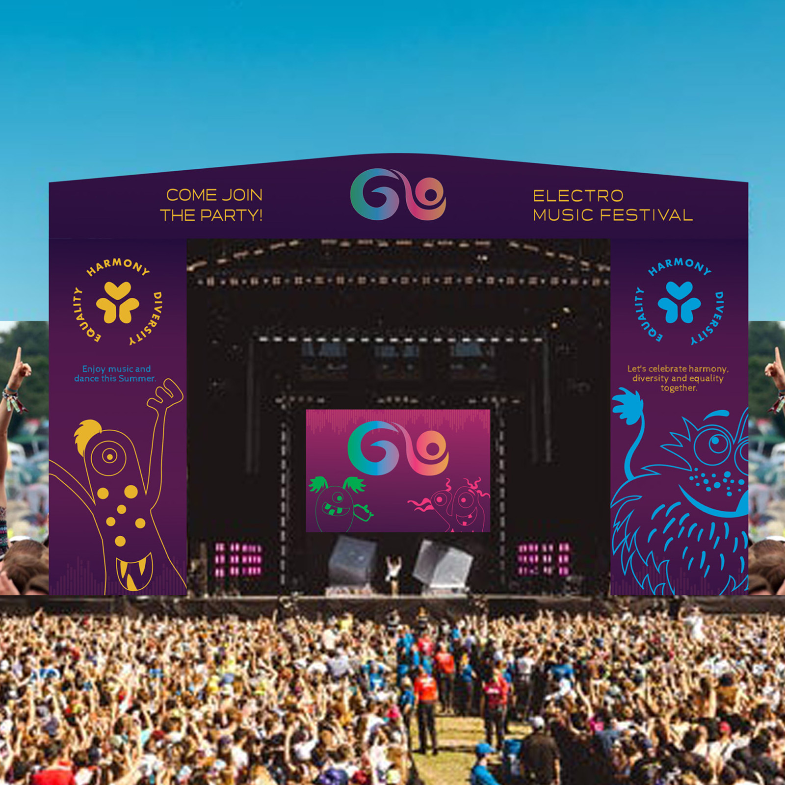
The project was to design a summer festival with a theme of my choice. The festival I designed is an electro house music festival as music is one of my passions.

Through music that brings people together from all over the world and creates a sense of unity, the festival will promote peace and respect for others, no matter where they come from, what they look like or what they like.

The festival’s name and brand colours reflect its values of diversity, equality and harmony; and the style used to create the characters, which are one of the branding elements, is full of fun and alludes to equality.
Audience and Message
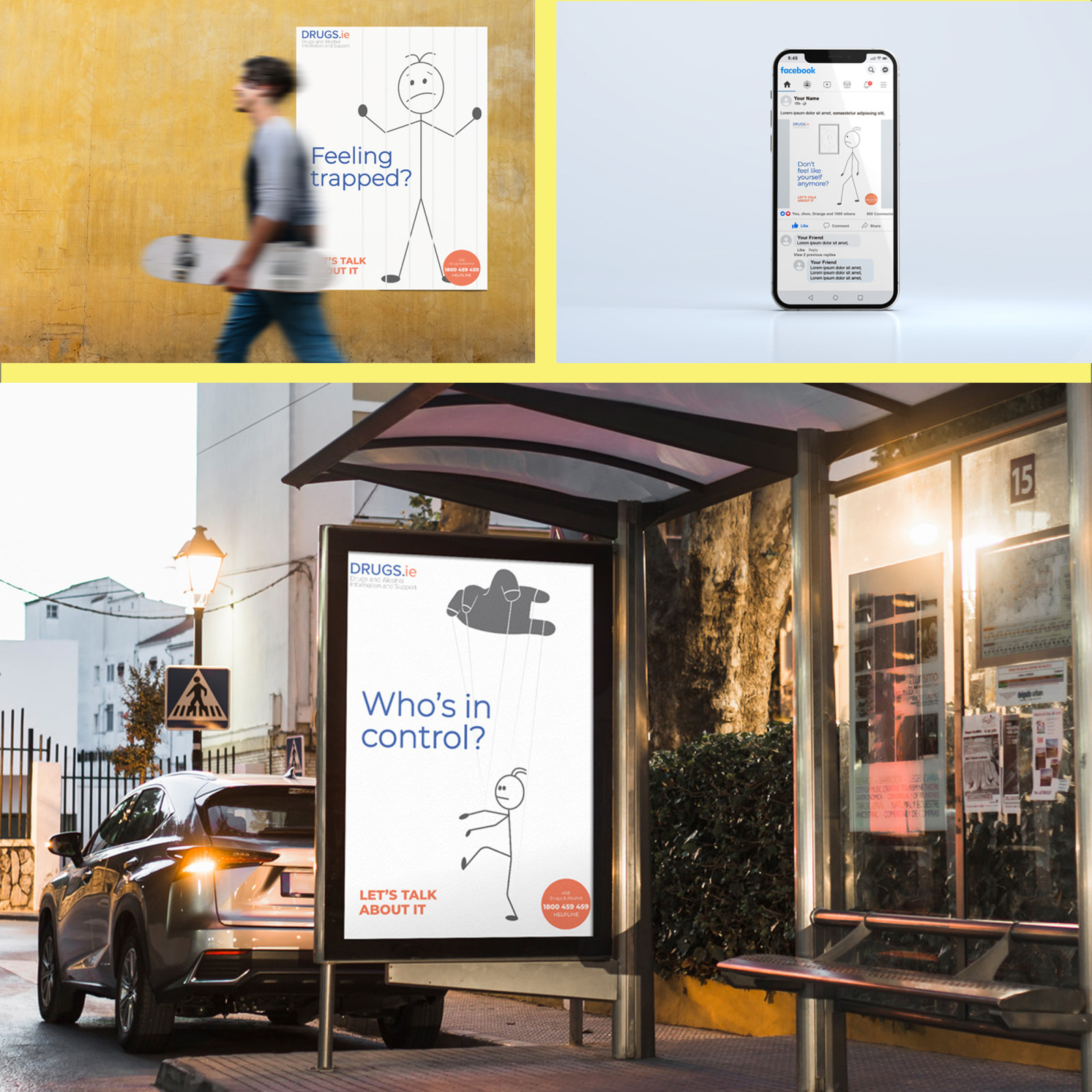
The aim of the project was the selection of an existing non-profit organisation and the rebranding of the organisation in order to reach its target audience more ef- fectively.

The organisation that I chose, DRUGS.ie, provides information on dangerous drugs and directs those who are interested to a service that will meet their needs.

The revamped brand incorporates features from the niche sector (typeface, col- ours). The design of the materials used to contact the target audience is kept to a mini- mum to allow for a more effective message.

Visual Identity: That’s so Basic!
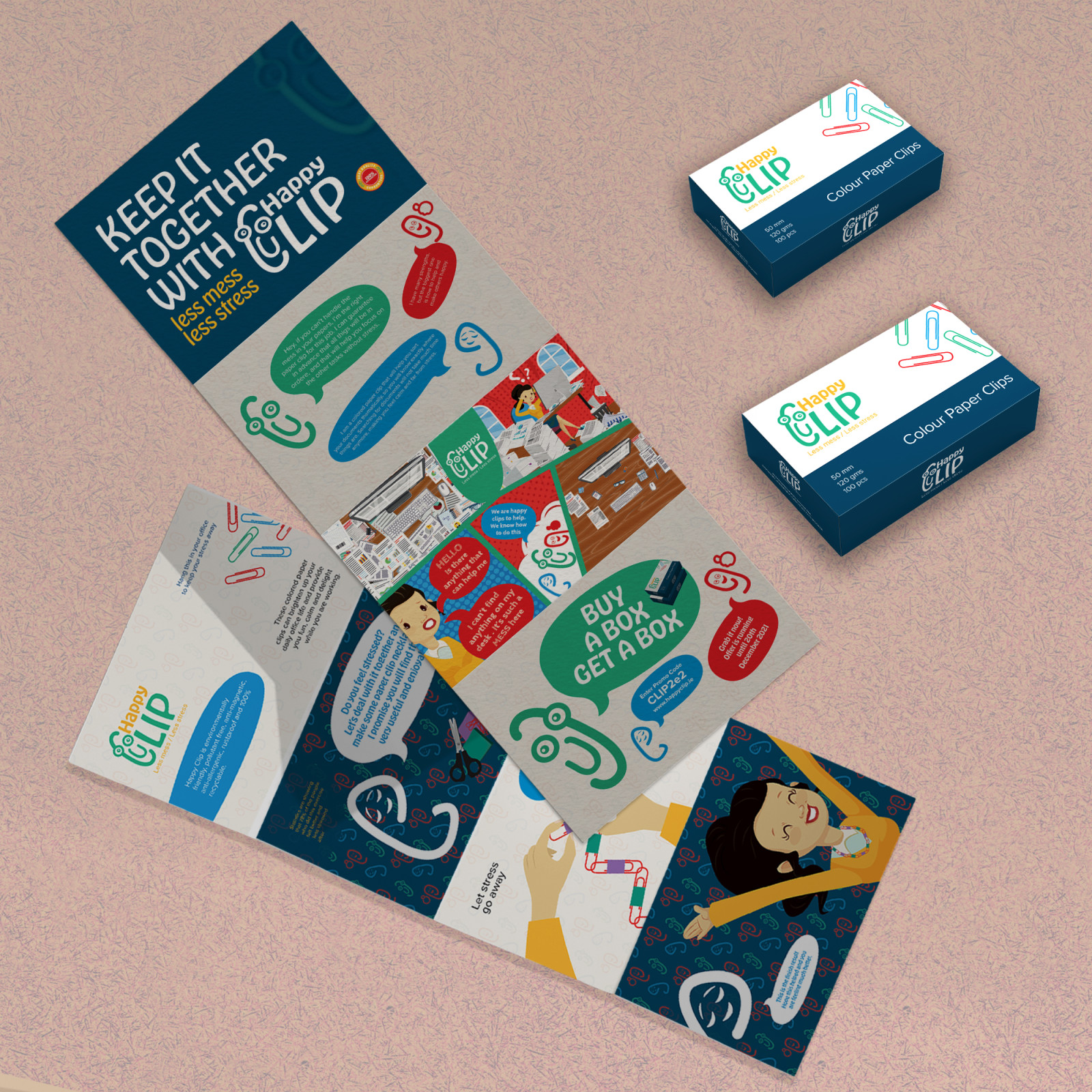
The aim of the project was to breathe new life into a basic (boring) product that is used every day, but whose branding does not reflect its characteristics.

The product chosen was a paper clip, for which a corporate identity was created. The brand logo is memorable to reach the target audience and the tagline reflects the characteristics of the product and its benefits.

The promotional material was designed in the style of a story about a product that is full of fun and at the same time increases the possibility of a quicker digestion by interested people.

More Graphic Design Communication

Griffith College Logo